
Overview
Introduction
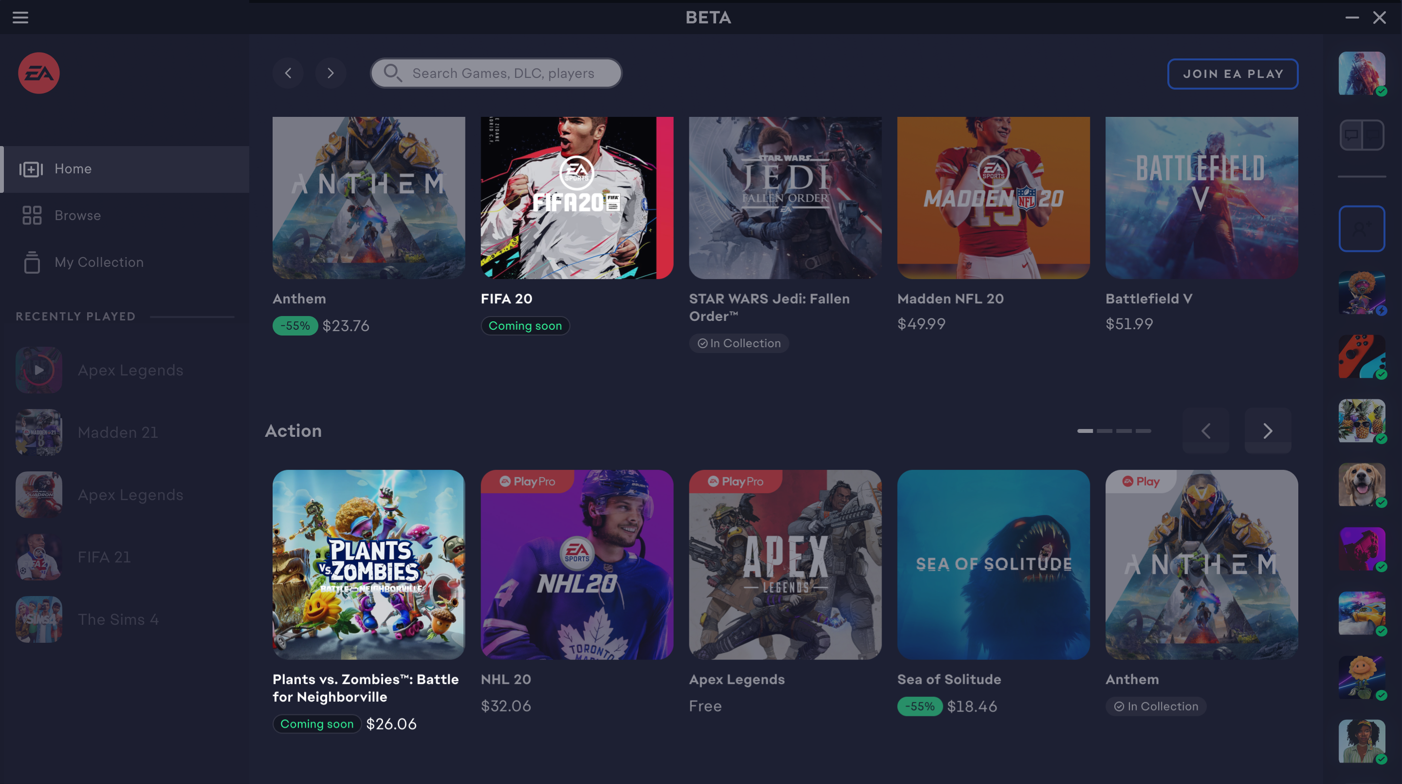
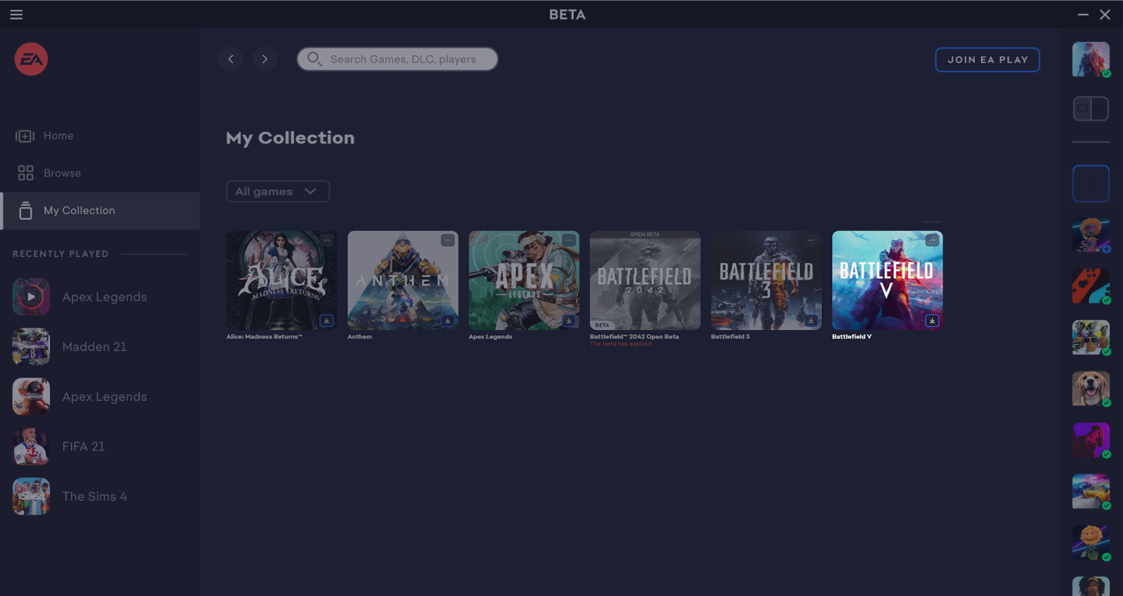
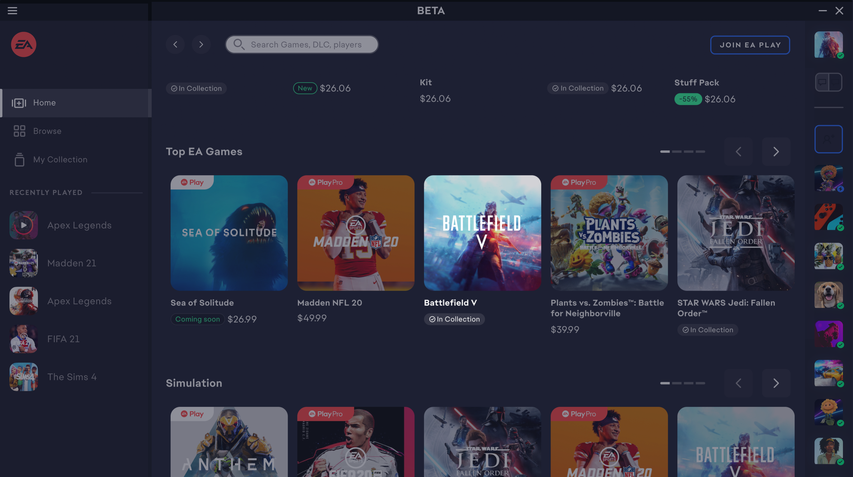
The EA App is a PC platform for players to download and manage their games, as well as connect with other players across platforms.

Problem
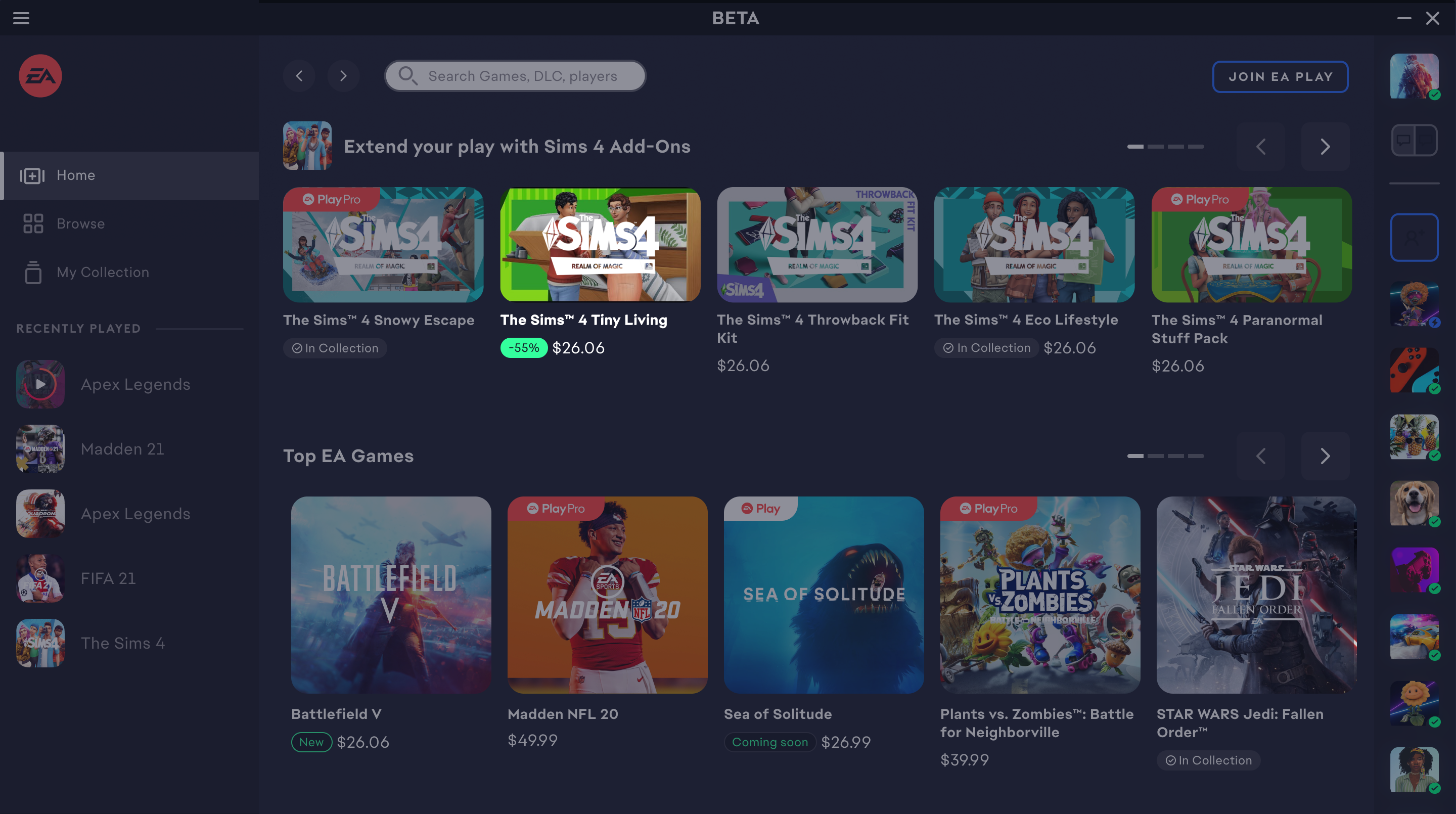
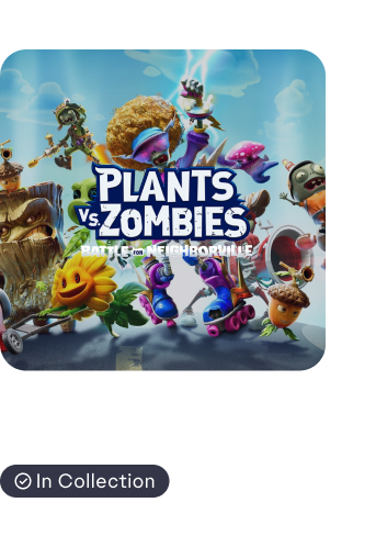
Game tiles are presented at the same level of importance preventing users from making efficient purchasing decisions.
Affect on Business
Discounts and novelty are the main motivators for game purchases. However, users cannot recognize the status of the game or their ownership of a game. This is a missed opportunity for the business to draw increased attention to specific tiles.
Solution
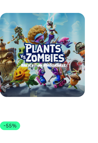
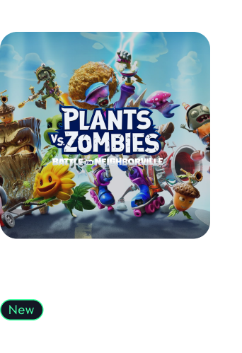
skip to solution5 game states to inform and attract buyers while they interact with the EA app.
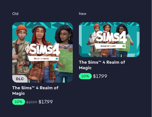
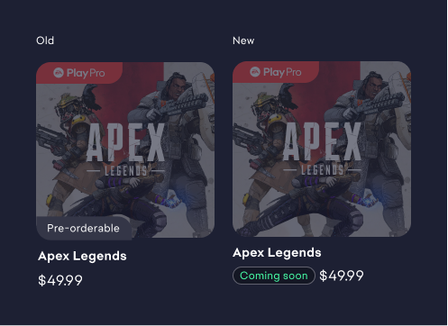
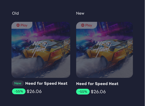
Before

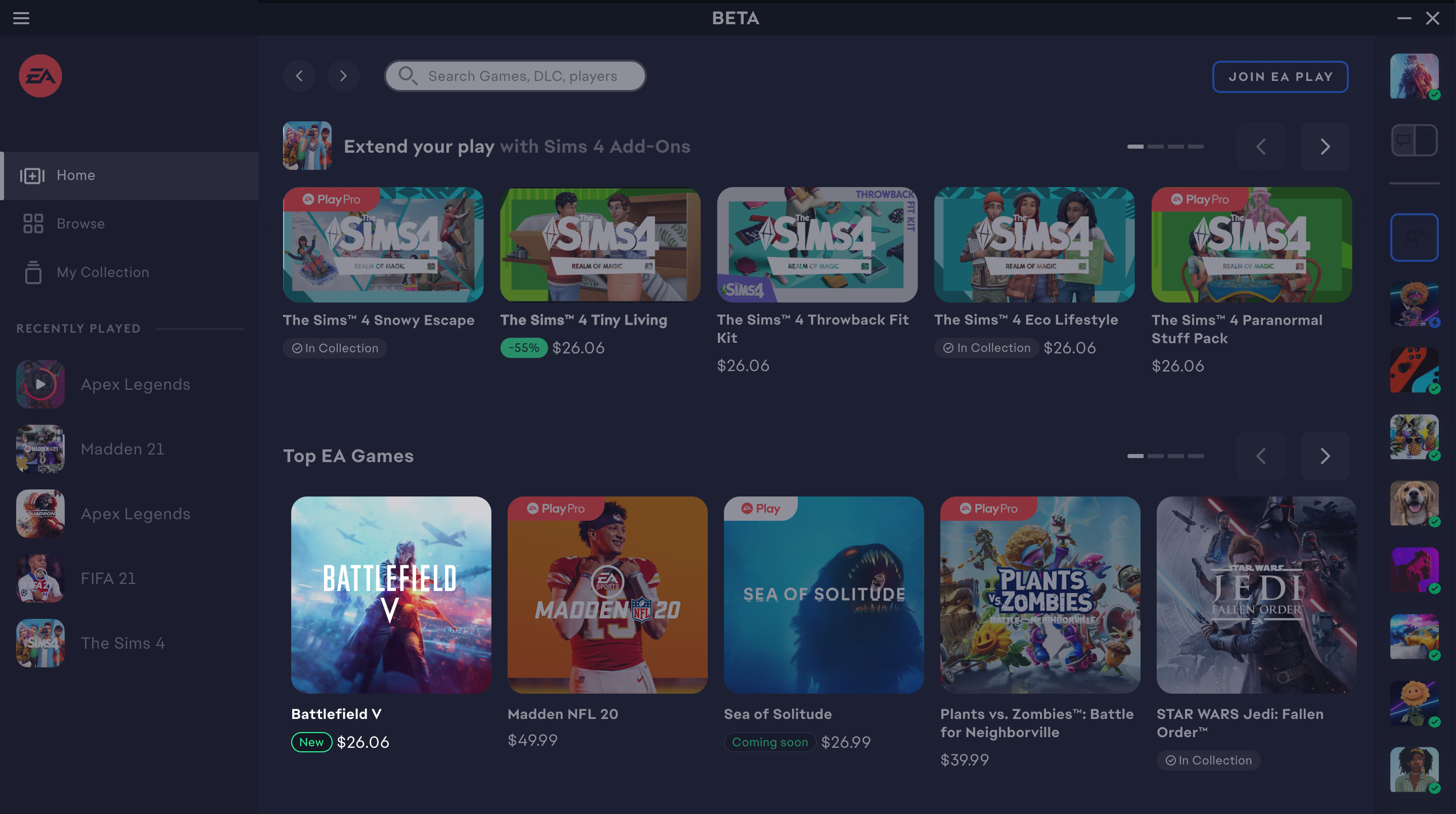
After

Design Process
In App Analysis
To familiarize with game tiles and the application, I conducted an audit and identified potential inconsistencies and gaps.
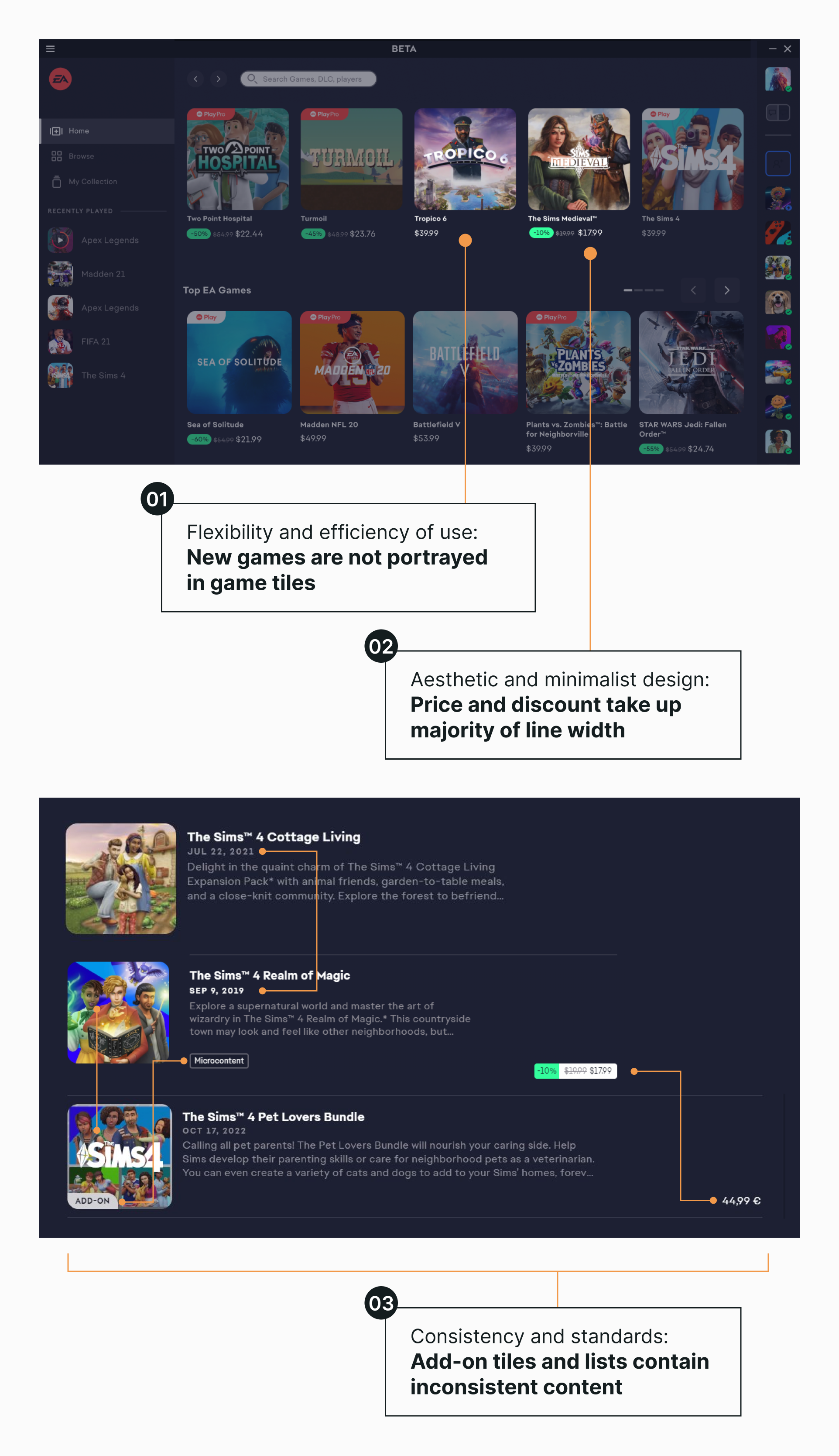
Problem prioritization
Considering time and cost constraints, we focused on problems with the least effort but highest impact.
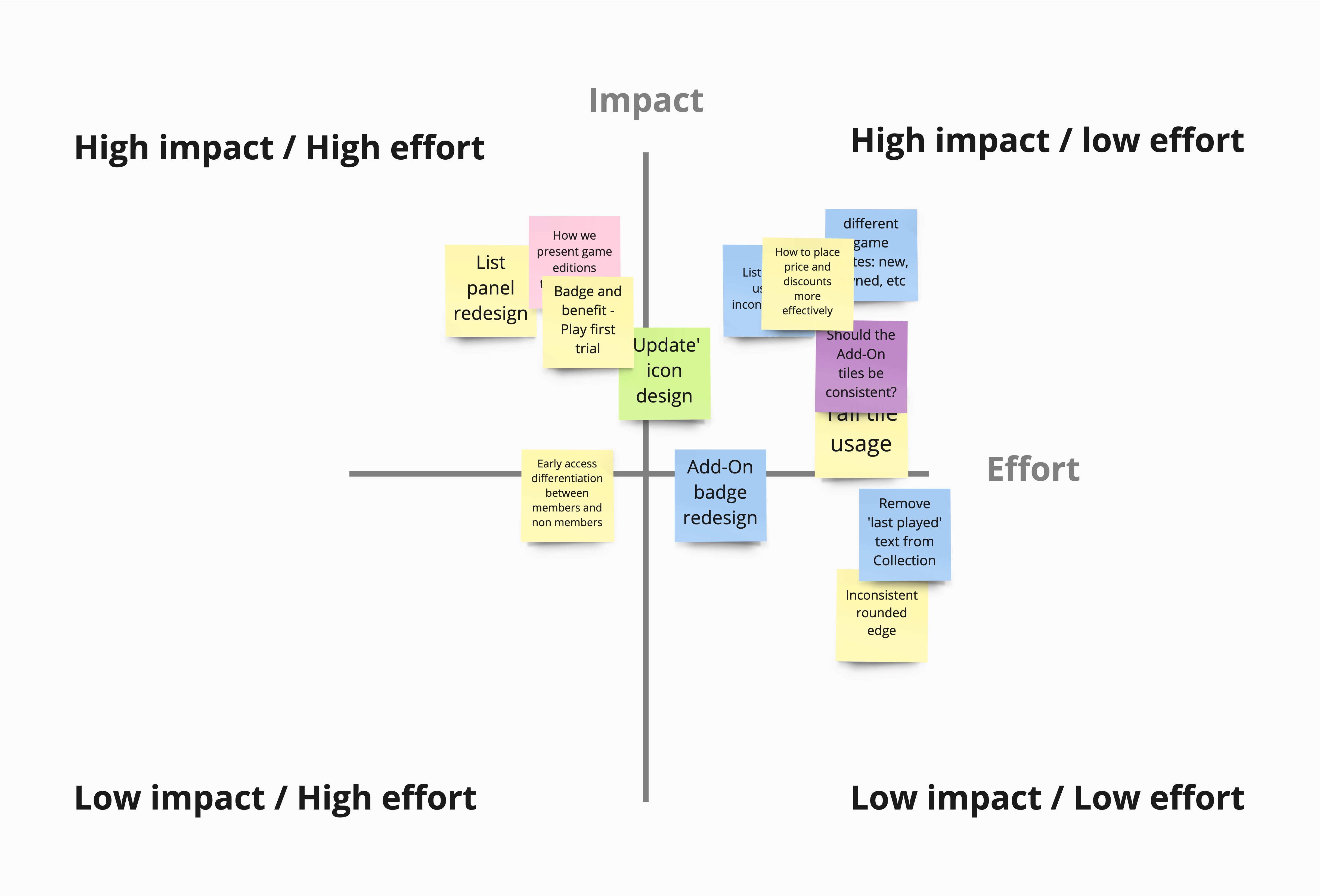
Focus Areas
How might we present different game states to help users make decisions more effectively.
User Research
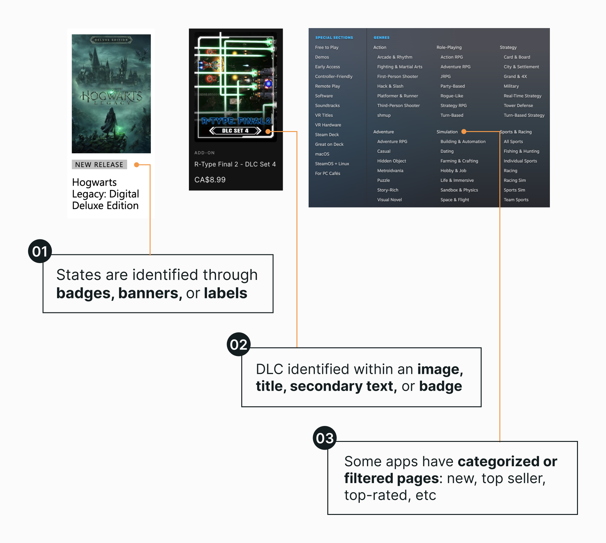
Competitive Analysis
Goal: How do competitors present different states, balance content copy, and differentiate between games and DLC (game add-ons)?
Applications analyzed: Xbox Games, Epic Games, Battlenet, Steam and Fanatical.
Design Space
How might we present different game states while leveraging and minimizing existing design systems?
Existing Design Patterns
Current Design

A game tile consists of multiple components. Since we want to use utilize the current design system and create minimal change, the components I want to leverage are the secondary badge, secondary text, and label.

Design Revisions
First Draft
It was agreed upon that this design could be pursued further because the separation between the badges and labels helped create a stronger visual hierarchy.

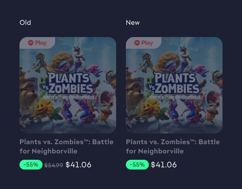
However, one issue that we encountered is the visual noise produced by the 4 different labels within the add-on tile.

Narrowing Design Space
How can we minimize the design of the add-on tile?
Design Changes
01
Remove strike-through price.
02
Remove Add-on(ex.DLC) labels
03
Replace pre-orderable with coming soon
04
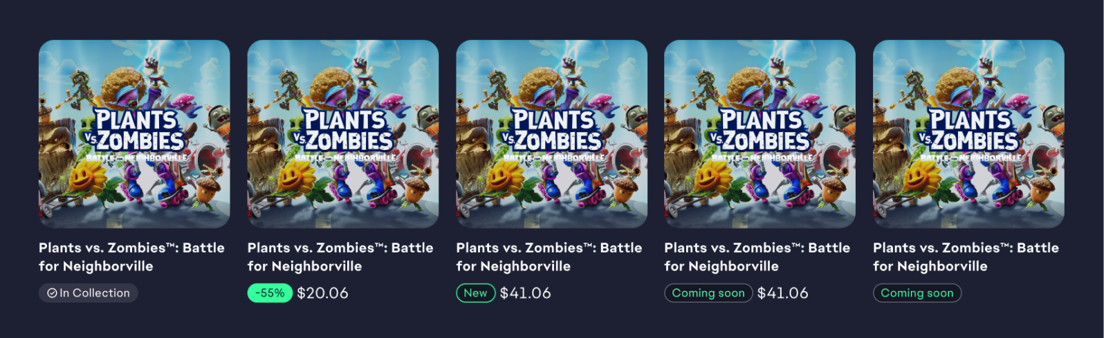
Generate a one state system
Design Considerations
Information Hierarchy
Through some exploring, we decided that the best fit was having the 'New' label placed in front of the game title because it provided separation between the other labels and a clear hierarchy.

Visual Hierarchy
Due to sales being the main driver of revenue, the discount state (on the very left) leads in the visual hierarchy, followed by the 'New' state, which is a key motivator for players.

Design Priority
Each state takes a different priority from the other. When states are in conflicting situations, the labels on the left take higher priority.

Game States Final Design
Success Criteria
👍 Users can clearly distinguish different tiles
👍 Users can differentiate between game tiles and add-ons
👍 Complexity is reduced within the game tile system
👍 Existing design components are leveraged
Final Polish
To Attract


To Inform
Impact
Since qualitative measurements are limited within the EA Application, many of our KPIs are based on user observations from interviews. When metrics become more robust, I am interested in bounce and rentention rate.
📈 Monetization: Purchase increase in pre released games
🗣️ Attitudinal Feedback: "I can see I own these Packs", before the change: "I think I own all of these"
Reflection
🚧 Designing with constraints
When working at companies that have well-established design systems, a significant part of creating a new product feature involves delving into the existing design patterns. Equally important is grasping the context in which these designs operate, as it's integral to comprehending how these elements can influence a user's overall experience.
🔑 Communication is Key
Remote work presents a distinct set of challenges compared to office-based work, where you can effortlessly keep your co-workers and manager in the loop about your projects. I've adapted by proactively providing regular updates to my manager and scheduling calls to stay informed about what others are working on.
👭 Understand your Audience
During my internship, I had the opportunity to present my design ideas to both the manager and director. What I found most valuable was investing time in understanding my audience and distilling my ideas into a few key takeaways that could easily be absorbed, rather than overwhelming them with excessive detail.